

Today is one of the biggest-ever updates to Yellow Optic itself as a whole.
The reception to Yellow Optic has been incredible over the years, and it is incredibly hard to nail down a new design that embraces the future. It shouldn’t just be a new design, it should be a much better design.
The collaboration with Nenetl had been truly electrifying. We began all of this work back in 2018, and we are so relieved to finally be able to show it with you.

Three years the massive difference.
Design
How do you make something entirely new yet utterly familiar? We took deep dives into the minute details of every character - the exact colors of the buttons on dress shirts, the exact folds that comprise the sleeves of Luna’s uniform, the exact build and curves that truly fit the character as a living, breathing person, and the exact models of watches they would have been wearing three years into the future. It’s not just to pay tribute to the original, but to indeed go boldly with none has been before.
Not only that, we paid attention to the smallest details. As every character is over 10,000 pixels tall, many hours were spent to nail down the most minute features. Every single pixel was to fall within the lines correctly, and strict tolerances meant coloring quality down to the pixel level. And we mean it— whole portraits were re-drafted even if the fuzz pixels have a 5% deviation in shade, and whole pictures were completely re-drawn if even a feature was off by millimeters.
The Kayla portrait went through over a hundred revisions spanning a six-month production timeframe.
All of this work meant that every portrait is truly flawless— You might not be able to see it, but you’ll certainly be able to feel it.
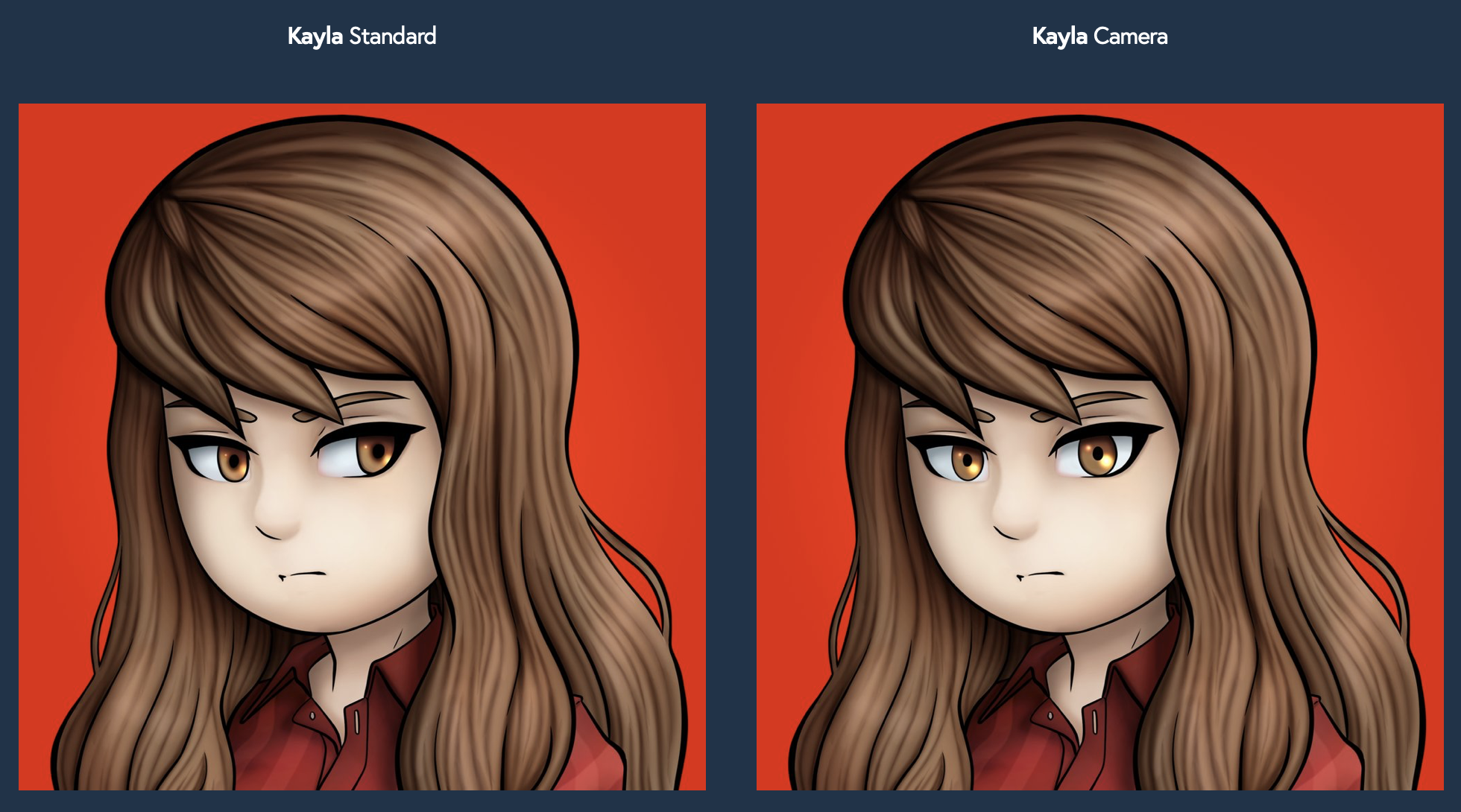
Your pick— Should Miss Ferrule look at the camera or not?
The new DLC Page
It’s the biggest DLC page update in history. Everything is more beautiful, cleaner, and more delightful. No longer would you need to scroll through disorienting sub-sections to get to everything. We found a solution to all the files, and you need to click through it to realize it.
For the first time, the portraits’ design extends for the characters to interact with the camera as well. While the previous generation was unbalanced in how we handled the dynamic between the models and our cameras, the new profile pictures can have your favorite character face the camera for a closer connection in any app you deploy it towards.
Luna can finally look at your friends with her big, blue, adorable eyes. That should smooth things over with your frenemies and rivalries, if you are unfortunate enough to have them sticking around. We wish you the best.

Rated E for Effort
Of course, none of this would be possible without the help of our artist friend Nenetl and the tireless work she has put in as we work together for a better experience for all of you. She deserves a big spot now that the transition is fully complete, and off-and-running. Every single corner of the yellowoptic.com experience is drenched in her style, which after two years of working (and counting), also slowly evolved into something uniquely Yellow Optic.
The Europa typeface honors the original Avenir in its simplicity and similarity in glyph design. Beautiful subtleties make for a design that is more refined, a site that is more unified, and a brand that is more consistent. You will see it everywhere you go— including some re-releases we can’t discuss right now.
The entire site now wears the proud Europa dress as this initiative winds down. We hope you like it.
We always strive to be uncompromising in every inch of products we put out. This update represents all of our tireless effort to constantly make it better. This creates a Yellow Optic that more people will love.